Tulip Property Management
In-depth information about the project development and implementation
Client:
| Industry:
| Service Provided:
| Deliverable:
|
Client's Requirements:Tulip Property Management approached us with a clear vision: they wanted a logo that captured the essence of their brand. The client emphasized the following elements:
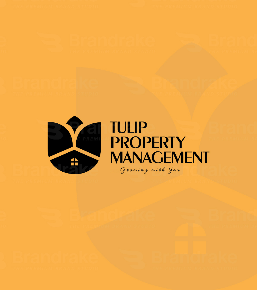
The client requested a minimal and modern logo that would be clean, memorable, and timeless. | Our Approach:We began the project by exploring ways to seamlessly integrate the tulip flower, crown, and home within a unified design. After several sketches and design explorations, we landed on a logo that artfully blends these three elements:
|
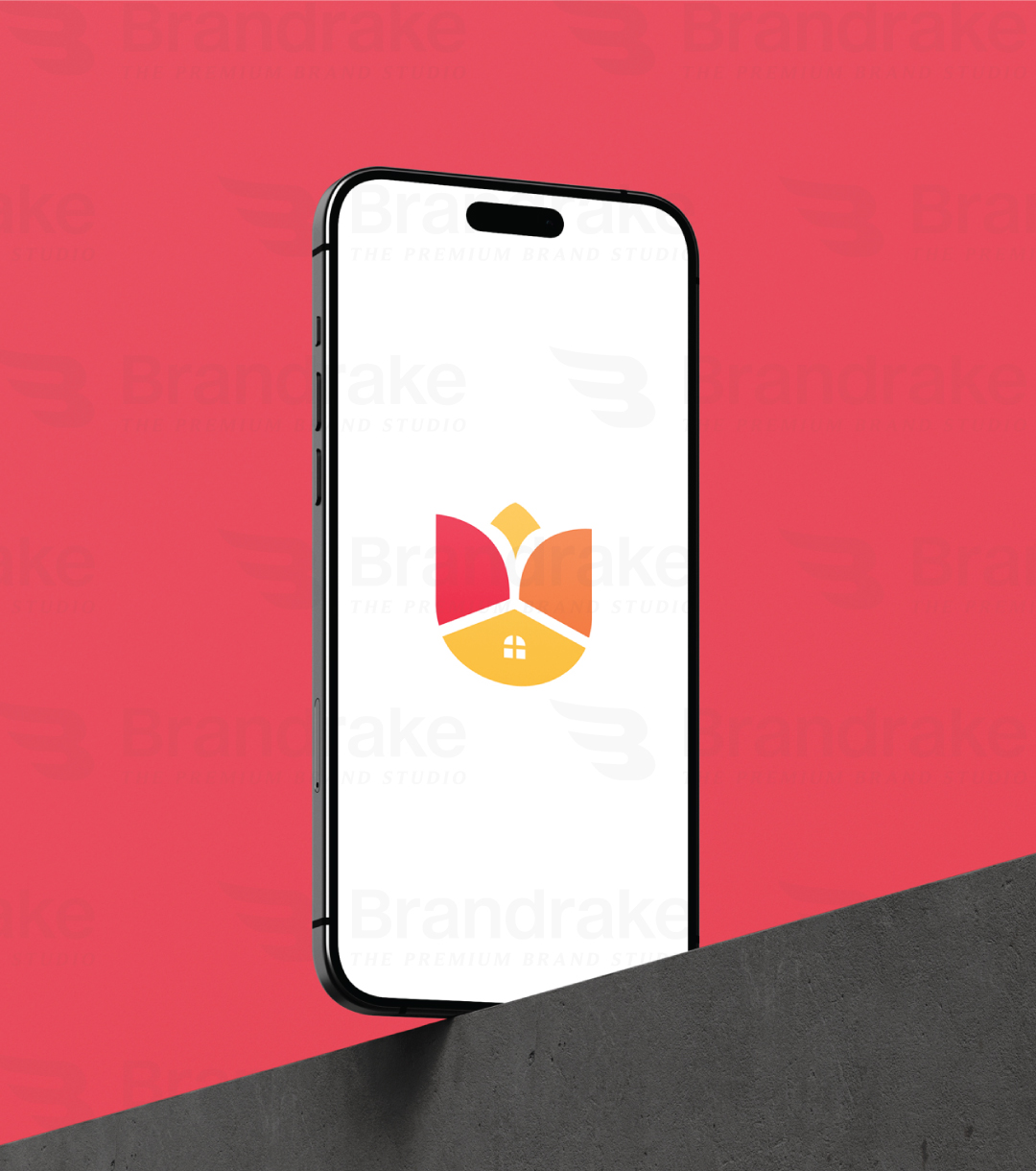
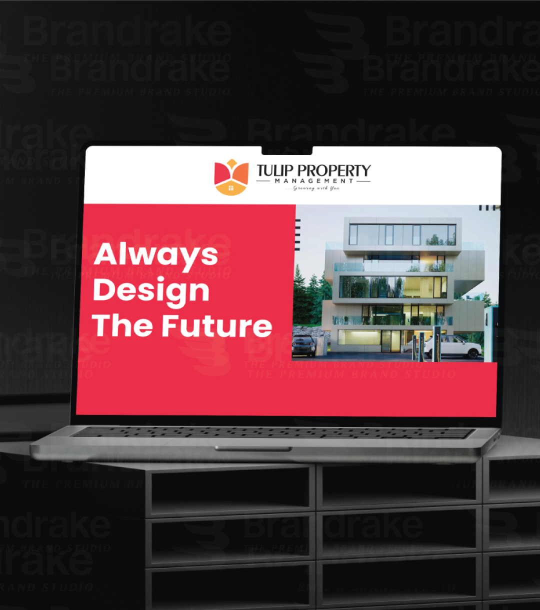
OutcomeThe final logo is a harmonious composition that captures the brand’s personality – modern, minimal, and deeply connected to both the housing and growth themes. The clean lines and thoughtful iconography ensure that the logo works across various mediums and scales seamlessly. The tagline, "Growing with You," was paired with the logo in a refined and elegant font to reinforce the message of growth and partnership. | ConclusionThis project was a fantastic opportunity to turn a complex brief into a sleek, modern identity that speaks to both the emotional and practical aspects of property management. At Brandrake, we take pride in crafting visual identities that resonate with our clients’ audiences and bring their stories to life. |
Project Gallery
Visual documentation of the project development and final results
